Understanding color relationships unlocks vibrant art; mixing primary colors yields secondary hues‚ expanding palettes for balanced‚ dynamic creations – a foundational skill․
Understanding the Basics of Color Theory
Color theory forms the bedrock of visual arts‚ dictating how hues interact and influence perception․ The color wheel‚ a circular diagram‚ organizes colors based on their relationships – primary‚ secondary‚ and tertiary․ Mixing primary colors (red‚ yellow‚ blue) creates secondary colors (orange‚ green‚ violet)․ Understanding analogous (harmonious) and complementary (contrasting) color schemes is crucial․
Furthermore‚ color temperature – warm versus cool – impacts mood and depth․ Effective mixing requires grasping subtractive (paint) versus additive (light) principles․ Mastering these basics empowers artists to achieve desired effects and avoid common pitfalls like muddy colors or vibrancy loss․
The Primary Colors
Red‚ yellow‚ and blue are foundational; they cannot be created by mixing other colors‚ serving as the essential building blocks for the entire palette․
Red‚ Yellow‚ and Blue: The Foundation of Color
These three hues represent the purest form of color‚ acting as the genesis for all others․ Red evokes energy and warmth‚ while yellow embodies happiness and light․ Blue‚ conversely‚ suggests calmness and serenity․
No mixture of other colors can authentically reproduce these primaries; they are inherently unique․ Mastering their individual properties is crucial․ Understanding how they interact—through mixing—is the key to unlocking a vast spectrum of shades and tones․
Artists rely on these foundational colors to build complex palettes‚ creating depth and nuance within their work․ They are the cornerstones of color theory and essential for any aspiring artist․
The Secondary Colors
Orange‚ green‚ and violet emerge from blending primary colors; these hues broaden the palette‚ offering new possibilities for artistic expression and visual harmony․
Orange‚ Green‚ and Violet: Mixing Primary Colors
Creating secondary colors is fundamental to understanding color mixing․ Orange results from combining red and yellow‚ offering warm‚ energetic tones․ Green emerges when blending blue and yellow‚ representing nature and tranquility․ Violet‚ a captivating hue‚ is born from mixing red and blue‚ evoking creativity and mystery․
The precise ratios of primary colors influence the resulting secondary shade; more red yields a reddish-orange‚ while increased yellow creates a brighter orange․ Similarly‚ adjusting the balance between blue and yellow impacts the green’s warmth or coolness․ Mastering these combinations unlocks a wider spectrum of artistic possibilities‚ allowing for nuanced and expressive color palettes․
Tertiary Colors: Expanding the Palette
Tertiary colors arise from blending a primary and neighboring secondary hue‚ creating shades like red-violet or blue-green – enriching artistic expression․
Creating Colors by Mixing a Primary and Secondary Color
Expanding beyond primary and secondary colors involves skillfully combining them to unlock a wider spectrum of hues․ For instance‚ mixing red (primary) with green (secondary) doesn’t yield a vibrant result‚ often leading to a muddy brown․ However‚ combining red with yellow-green‚ or blue with yellow-orange‚ produces cleaner‚ more nuanced tertiary shades․
This process demands careful observation and incremental additions of color․ Start with a small amount of the primary color and gradually incorporate it into the secondary‚ constantly assessing the resulting tone․ Understanding the undertones within each color is crucial for predictable and aesthetically pleasing outcomes․ Experimentation is key to mastering this technique!
Color Relationships on the Wheel
The color wheel reveals harmonious pairings – complementary for contrast‚ analogous for serenity‚ and triadic for balance – guiding impactful and visually appealing color schemes․
Complementary Colors: High Contrast and Vibrancy
Complementary colors‚ positioned opposite each other on the color wheel – such as red and green‚ or blue and orange – create striking visual contrast and vibrancy when combined․ This dynamic pairing maximizes impact‚ making each hue appear more intense․ Utilizing complementary schemes draws the eye and generates excitement in artwork․ However‚ careful balancing is crucial; overuse can lead to a jarring effect․
Consider muting one color slightly to achieve harmony․ This technique is invaluable for artists seeking bold‚ attention-grabbing compositions‚ offering a powerful tool for visual storytelling․
Analogous Colors: Harmonious and Soothing
Analogous colors reside adjacent to each other on the color wheel – think blues‚ blue-greens‚ and greens․ These combinations evoke a sense of harmony and tranquility due to their close relationship․ They offer a naturally pleasing aesthetic‚ often found in nature‚ creating a soothing and cohesive visual experience․
Analogous palettes are excellent for establishing mood and atmosphere‚ providing a subtle yet effective way to convey emotion․ Varying the values and saturation within the scheme adds depth and interest․
Triadic Colors: Balanced and Dynamic
Triadic color schemes utilize three colors equally spaced on the color wheel – for example‚ red‚ yellow‚ and blue․ This creates a vibrant and balanced composition‚ offering high contrast while maintaining harmony․ These palettes are energetic and visually stimulating‚ preventing monotony while avoiding the harshness of complementary pairings․
Successfully employing a triadic scheme often involves letting one color dominate and using the others as accents‚ ensuring a balanced and dynamic visual impact․
Color Mixing Techniques
Color mixing differs based on the medium: subtractive mixing (paints) combines pigments‚ while additive mixing (light) blends wavelengths for varied results․
Subtractive Color Mixing (Paint)
Subtractive mixing‚ crucial for paints and inks‚ functions by absorbing certain wavelengths of light and reflecting others․ Each added pigment diminishes the lightness‚ hence “subtractive․” Starting with white‚ adding color subtracts light․ Mixing primary colors – red‚ yellow‚ and blue – creates secondary colors: orange‚ green‚ and violet․ Further mixing yields tertiary colors‚ blending primary and secondary hues․
The more colors combined‚ the darker and less vibrant the result‚ potentially leading to muddy tones if not carefully managed․ Understanding pigment properties and transparency is key to achieving desired shades and avoiding unwanted color shifts during the mixing process․
Additive Color Mixing (Light)
Additive color mixing‚ employed in screens and light sources‚ operates differently than paint․ It adds wavelengths of light together․ Starting with darkness‚ adding light creates color․ The primary colors in this system are red‚ green‚ and blue (RGB)․ Combining these creates secondary colors: cyan‚ magenta‚ and yellow․
When all three primaries are fully added‚ the result is white light․ This contrasts with subtractive mixing‚ where combining all colors results in black․ Understanding additive mixing is vital for digital art and screen-based color representation․
Practical Color Mixing Recipes
Experimentation is key! Precise ratios vary‚ but starting with small additions of color allows for controlled adjustments toward desired shades and tones․
Achieving Specific Shades of Green
Creating diverse greens involves balancing blue and yellow․ For a bright‚ spring green‚ use a larger proportion of yellow with a touch of blue․ Adding black will darken the green‚ resulting in shades like forest or olive green․
To achieve a cooler‚ more muted green‚ incorporate a small amount of white or even a hint of its complementary color‚ red‚ to neutralize vibrancy․ Remember‚ subtle adjustments make significant differences․ Experiment with varying ratios to discover unique green tones‚ and always document your mixtures for future reference!
Creating Different Tones of Purple
Purple‚ a secondary color‚ arises from mixing red and blue․ Varying the proportions dramatically alters the shade․ More red yields reddish-purple or magenta‚ while increased blue creates a cooler‚ more violet hue․
To soften purple‚ introduce white‚ resulting in lavender or lilac tones․ Darkening it with black produces plum or deep violet․ A touch of yellow can neutralize the vibrancy‚ creating muted‚ earthy purples․ Careful experimentation and documentation are key to mastering purple’s diverse range!

Color Temperature and Mixing
Warm colors (reds‚ yellows) evoke energy‚ while cool colors (blues‚ greens) suggest calmness; adjusting ratios shifts mixes towards warmer or cooler aesthetics․
Warm Colors vs․ Cool Colors
Warm colors‚ encompassing reds‚ oranges‚ and yellows‚ are often associated with energy‚ excitement‚ and warmth – think sunshine or a roaring fire․ They tend to advance visually‚ making objects appear closer․ Conversely‚ cool colors‚ like blues‚ greens‚ and purples‚ evoke feelings of calmness‚ serenity‚ and peace‚ reminiscent of water or a shaded forest․
These colors visually recede‚ creating a sense of depth․ When mixing‚ understanding this temperature difference is crucial․ Adding a touch of cool color to a warm hue can ‘tone it down’‚ while introducing warmth to a cool color can brighten and invigorate it․ Mastering this balance is key to achieving harmonious and visually appealing results․
Adjusting Color Temperature in Mixes
Fine-tuning color temperature involves subtle additions․ To cool a warm color‚ introduce a small amount of its complement – for example‚ a touch of blue to orange․ Conversely‚ warming a cool color requires a bit of its opposite‚ like red into green․ These adjustments aren’t about drastically changing the hue‚ but subtly shifting its overall feeling․
Remember‚ even a tiny amount of a contrasting color can significantly impact temperature․ Careful observation and gradual mixing are essential․ Consider the desired mood; warmer tones create excitement‚ while cooler tones promote tranquility‚ guiding your temperature adjustments․
Common Color Mixing Mistakes
Avoid muddy colors by using clean brushes and limited palettes; overmixing dulls vibrancy‚ losing the initial brilliance of your carefully chosen hues․
Muddy Colors and How to Avoid Them
Muddy colors often arise from overmixing‚ introducing too many pigments‚ or combining complementary colors excessively․ To prevent this‚ start with a limited palette‚ carefully selecting only the necessary hues․ Always clean your brushes thoroughly between colors to avoid unwanted contamination․
When mixing‚ gradually add color‚ observing the changes․ Resist the urge to blend everything together immediately․ Consider using a palette knife instead of a brush for cleaner mixing․ Remember‚ less is often more – you can always add more pigment‚ but removing it is difficult․ Prioritize clarity and intentionality in your mixing process․
Overmixing and Loss of Vibrancy
Excessive mixing breaks down pigment particles‚ leading to dull‚ lifeless colors․ The initial brilliance fades as hues become homogenized and lose their individual character․ To maintain vibrancy‚ employ a ‘broken color’ technique – applying distinct strokes of unmixed colors side-by-side․
Avoid relentless stirring; instead‚ gently combine colors until you achieve the desired shade․ Understand that optical mixing‚ where the eye blends colors‚ often creates a more luminous effect than physical mixing․ Preserve the integrity of your pigments for a dynamic and visually engaging artwork․

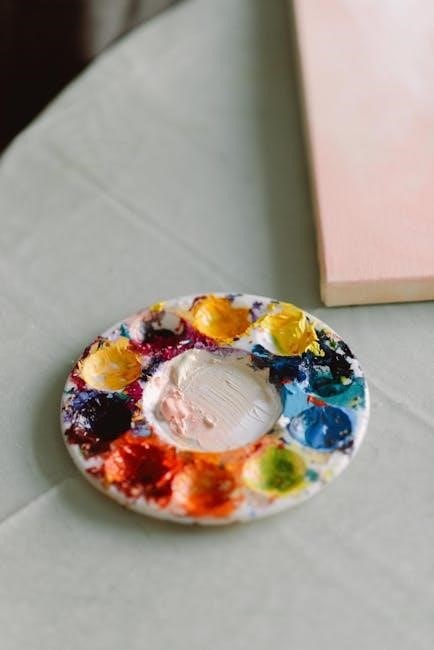
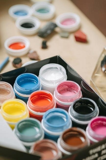
Tools for Color Mixing
Essential tools include color wheels‚ charts‚ and varied mixing mediums—each impacting texture and transparency‚ enhancing control and creative exploration of hues․
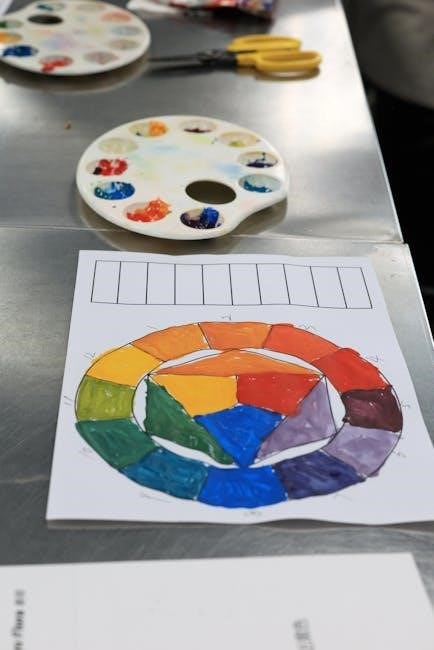
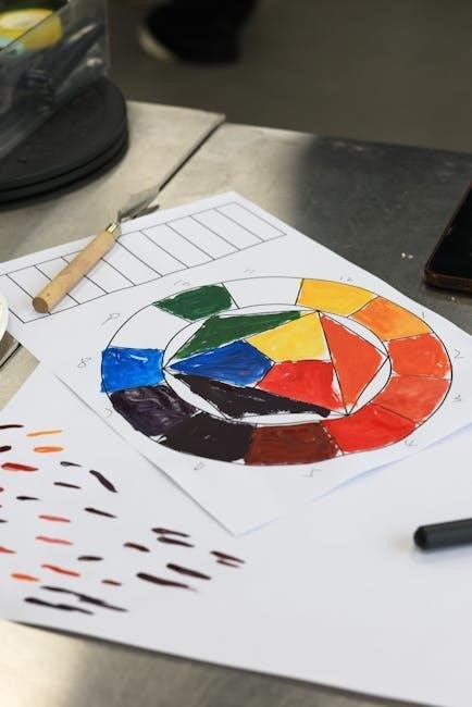
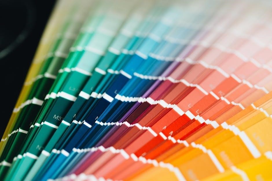
Color Wheels and Charts
Color wheels are indispensable visual tools‚ illustrating relationships between hues – primary‚ secondary‚ and tertiary – aiding in harmonious palette creation․ They demonstrate complementary‚ analogous‚ and triadic color schemes‚ crucial for achieving desired visual effects․ Charts‚ often displaying value and saturation scales‚ further refine color selection․
Digital versions offer interactive exploration‚ while physical wheels provide tactile learning․ Understanding a wheel’s layout allows artists to predict mixing outcomes‚ avoiding muddy colors and fostering confident experimentation․ Charts help visualize subtle tonal variations‚ essential for realistic rendering and nuanced artwork․ These resources empower both beginners and experienced artists․
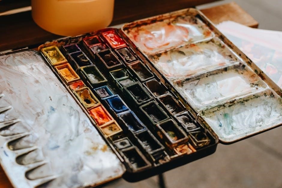
Mixing Mediums and Their Effects
Different mediums dramatically alter paint behavior and color appearance․ Oils offer slow drying times‚ enabling blending‚ while acrylics dry quickly‚ layering efficiently․ Watercolors create translucent washes‚ demanding careful layering․ Gouache provides opacity‚ resembling matte acrylics․
Adding mediums like linseed oil (oils) or flow improver (acrylics) modifies viscosity‚ gloss‚ and drying time․ Gel mediums add texture․ Understanding these effects is vital; a medium can enhance vibrancy‚ transparency‚ or create unique surface qualities‚ influencing the final artwork’s aesthetic and longevity․
Digital Color Mixing and the Wheel
Digital art utilizes color pickers and palettes‚ mirroring traditional theory; understanding the wheel aids in creating harmonious or contrasting digital compositions effectively․
Using Color Pickers and Palettes
Digital artists rely on color pickers to select precise hues‚ often displaying them within palettes for easy access․ These tools frequently represent color spaces like RGB or HSL‚ allowing for nuanced adjustments․ Understanding the color wheel’s relationships – complementary‚ analogous‚ triadic – becomes crucial when navigating these digital interfaces․ Experimenting with different color modes and utilizing palettes based on established color harmonies can significantly enhance your digital artwork․ Many programs also offer features to save custom palettes for consistent branding or stylistic choices‚ streamlining the creative process and fostering visual cohesion․
Applying Color Theory to Digital Art
Digital art benefits immensely from color theory principles․ Utilizing complementary colors creates visual pop‚ while analogous schemes offer harmony․ Understanding warm and cool tones influences mood and depth․ Digital tools allow easy experimentation with these concepts; layering modes and blending options mimic traditional mixing․ Consider the psychological impact of colors – red evokes energy‚ blue calmness․ Applying these principles enhances composition‚ guides the viewer’s eye‚ and ultimately elevates the artwork’s emotional resonance‚ resulting in more impactful and visually compelling digital creations․